Aim
To encourage you to challenge existing presuppositions and think laterally in order to find innovative solutions for a specific design problem. I must expose myself to a variety of strategic and creative processes that will help me develop the most effective and meaningful solution.
To encourage you to challenge existing presuppositions and think laterally in order to find innovative solutions for a specific design problem. I must expose myself to a variety of strategic and creative processes that will help me develop the most effective and meaningful solution.
Objectives
1. To produce high-quality design work and apply creative thinking throughout the ideation/design process.
2. To present a design solution suitable for the targeted demographic.
3. To present complex information in a simple, clear and effective way.
4. To create a carefully considered user experience from concept to final output.
Background
Auckland Transport (AT) is responsible for all of the region’s transport services from roads and footpaths, to cycling, parking and public transport. AT’s role as a transport provider is rapidly evolving to meet and anticipate fast-paced changes in how people in successful cities want and need to travel. They play an active role in shaping our city with more sustainable and networked modes of transport, and in integrating the diverse new ways their customers will be mobile in the near future.
AT is looking into new initiatives to be more inclusive and empower people, making it possible or easier for them to travel around the city. As part of this initiative, they are wanting to develop a suite of digital products offering alternative transport services for tertiary students with health conditions or impairments.
Target audience?
Commuters with dyslexia.
Competitors?
AT Transport, Citymapper, Google Maps and Moovit.

Research (Focus group)
For my user research, I conducted an interview with people with dyslexia at the Cellfield education centre based in Papakura, New Zealand. I learned that people with dyslexia rely on visual cues and sound to help them navigate, because of their trouble with reading and writing. The Interviewees also desired a service with a social component, where users can help each other navigate.
Approach
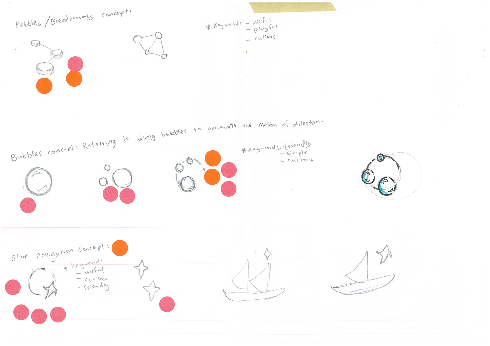
My solution to this issue is to create a digital experience inspired by the Hansel and Gretel fairy tale. In the story, Hansel and Gretel use pebbles to track their journey. Similarly, the pebbol™ transit app uses image referencing as checkpoints to help commuters navigate their way. Having a brand identity offers people with dyslexia a shared experience that differentiates the app from the other transit apps.

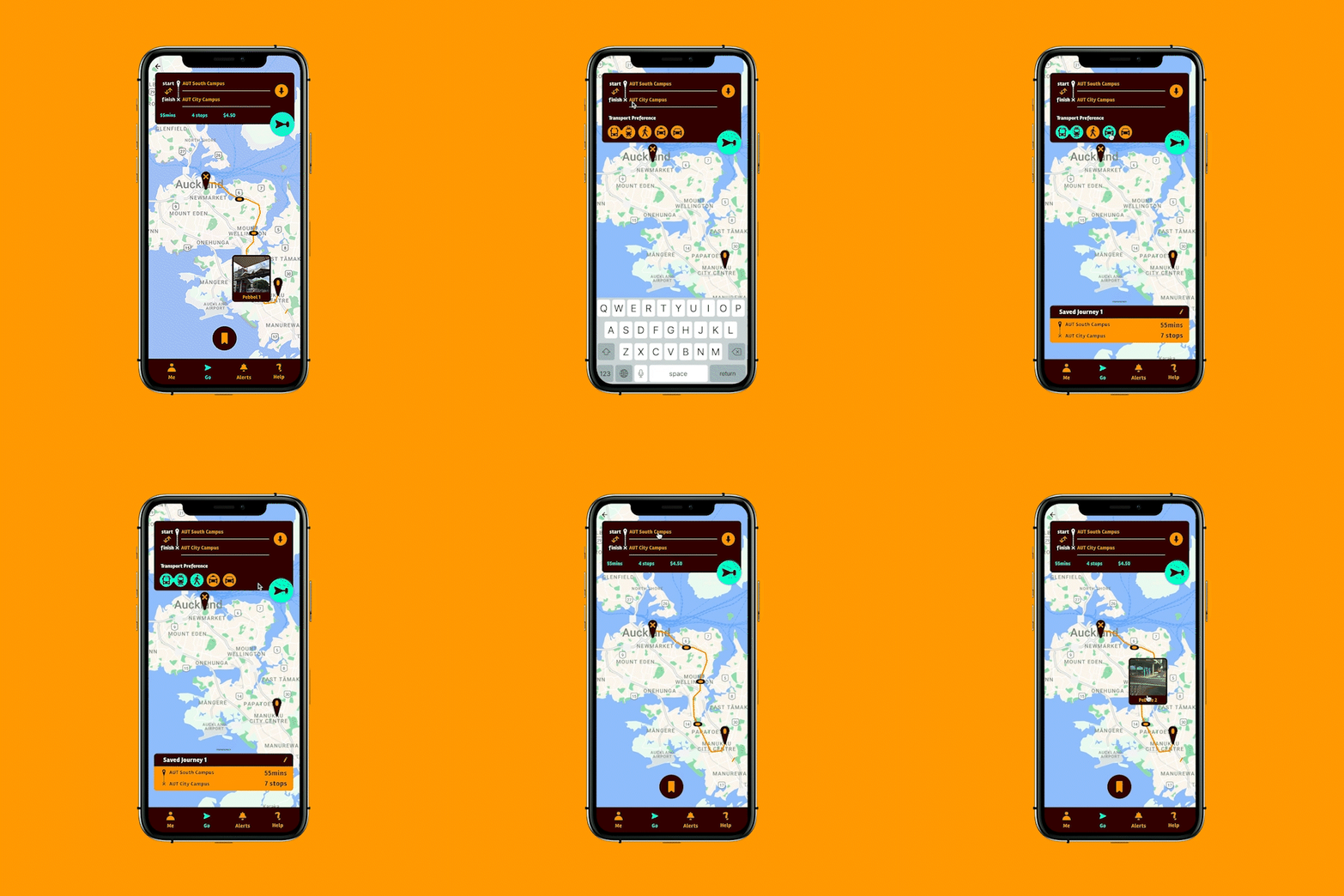
These branding elements are intended for the mobile app, websites, uniforms, installations and other mediums.
I followed the Style Guide by the British Dyslexia Association. I chose the san-serif typeface Rambla because it came in many styles and was easy to read. Another requirement I considered was that the letters p, q, d and b had to be distinguishable when flipped vertically and horizontally. This was done to ensure a comfortable reading experience for people with dyslexia.
I chose Rimu and Citrine as my main colours, accented by Patina. Again, I followed the Dyslexia Style Guide to ensure the colours met their requirements. I adjusted the screen colour contrast ratios based on the WCAG AAA standards so that the colours are at sufficient contrast for on-screen reading.
Sources
1.) https://www.bdadyslexia.org.uk/advice/employers/creating-a-dyslexia-friendly-workplace/dyslexia-friendly-style-guide
2.) https://www.dyslexiafoundation.org.nz/d_assessment.html
3.) https://webaim.org/resources/contrastchecker/
